Logo Design · Infrastructure & Corporate Services · 2022
Nabigaru: Logo Design Case Study
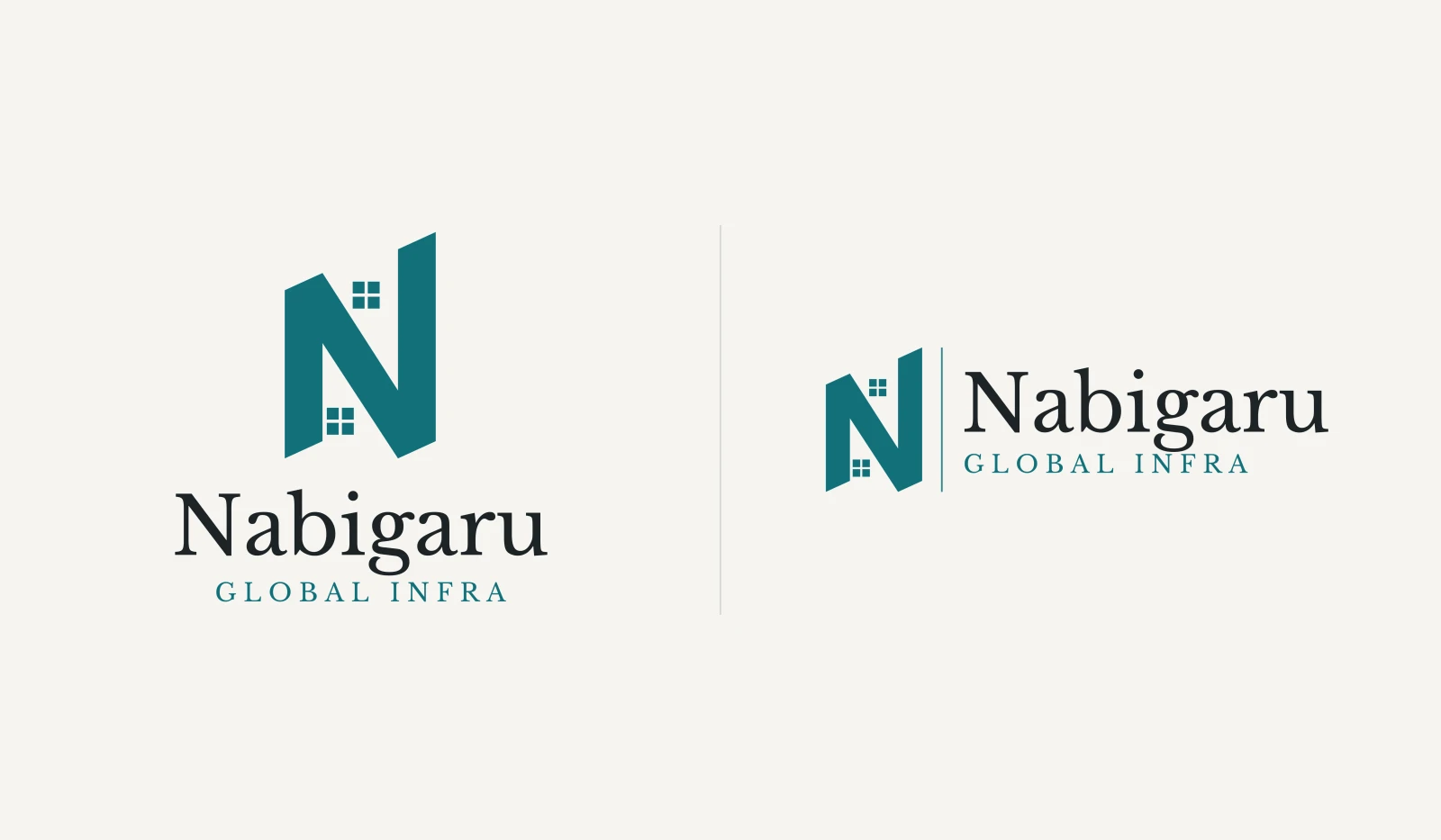
An N built like two towers, with windows in the gaps — the logo behind Nabigaru and Nabigaru Global Infra.
The brand
Nabigaru is one name across two businesses: Nabigaru Global Infra, which works on infrastructure development and construction, and Nabigaru, which provides corporate services and business support. Both came to Makos Digital as part of its first-ever client engagement, alongside Jehovah Rophe Infra, and Makos Digital designed the Nabigaru logo in January 2022.
How we approached it
The logo follows the same idea as the Jehovah Rophe Infra mark designed for the same engagement: a monogram whose letterform also reads as a building, set in a single colour and paired with a classical serif wordmark. One mark serves both companies — only the line beneath the name changes.
The identity
An N built like two towers
The N is drawn as two towers with slanted rooflines, joined by a heavy diagonal. In the two gaps the diagonal leaves — one opening at the top, one at the bottom — sit small four-pane windows, so the letter reads as a pair of buildings as well as an initial.
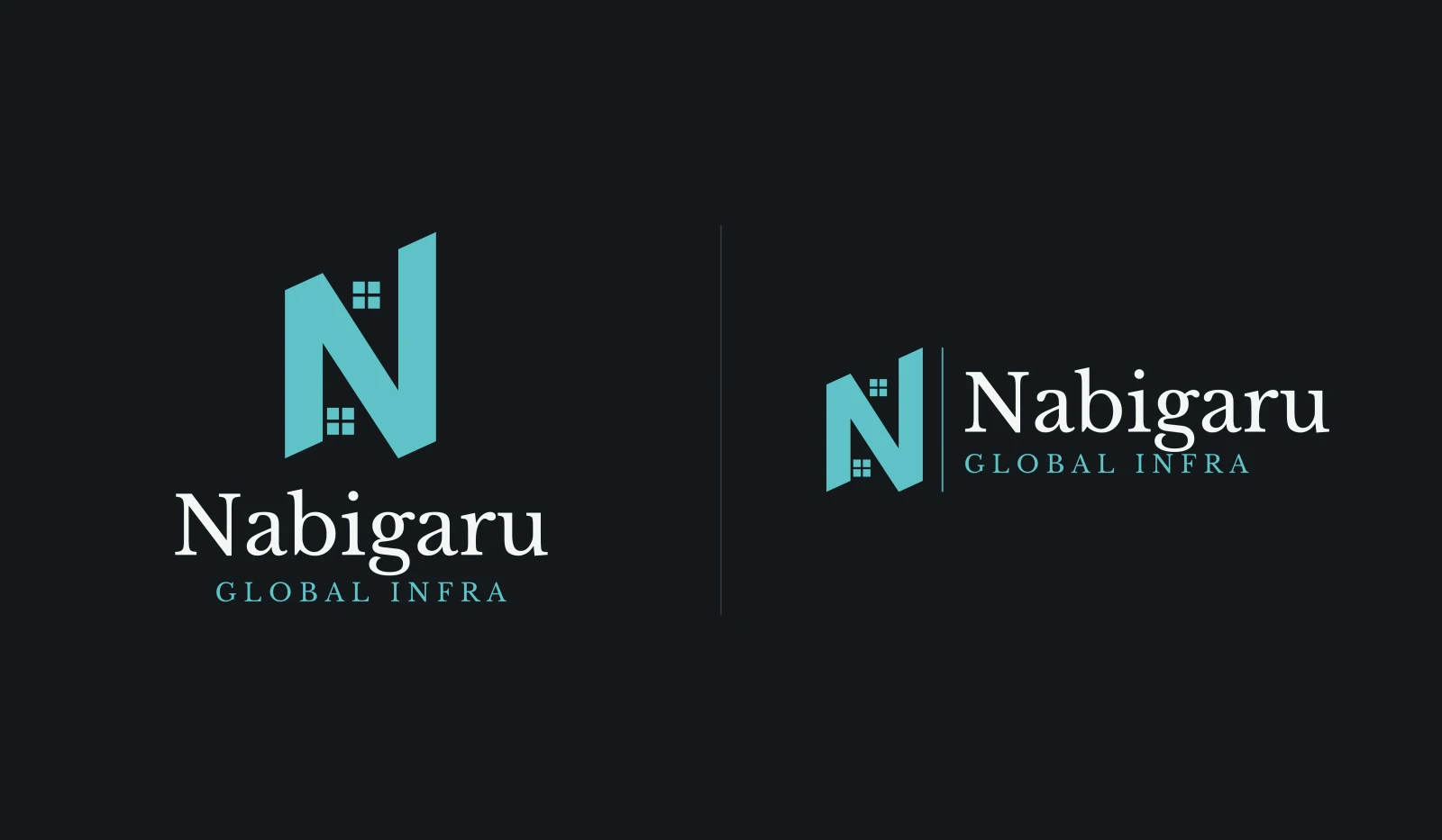
"Nabigaru" is set in a classical serif in near-black, with "GLOBAL INFRA" in spaced capitals beneath it for the infrastructure company. The colour is a single deep teal, used on its own or reversed out in white.
What the identity consists of
- Monogram: an N made of two towers and a diagonal brace, in a single deep teal
- Windows: four-pane windows in the two counters, so the initial also reads as buildings
- Wordmark: "Nabigaru" in a classical serif, with "GLOBAL INFRA" in spaced capitals for the infrastructure company
- Lockups: stacked and horizontal versions for light and dark backgrounds, plus the monogram on its own
Applications
The identity in use
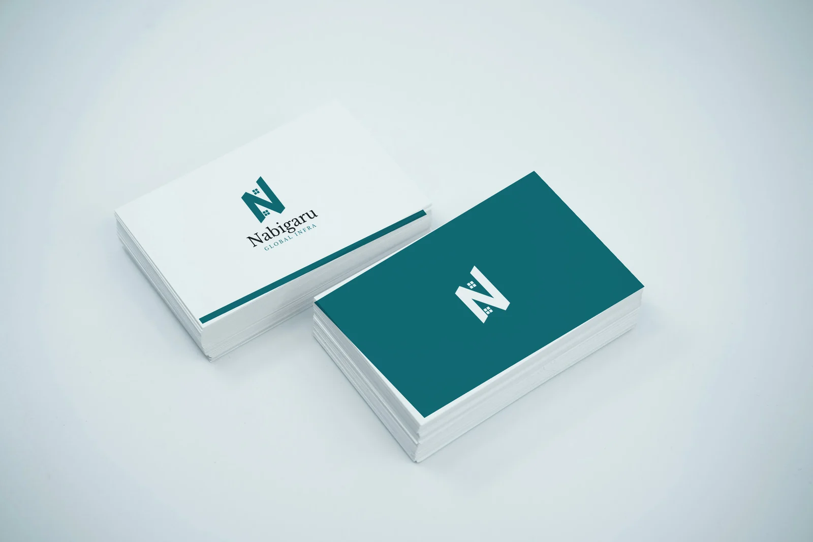
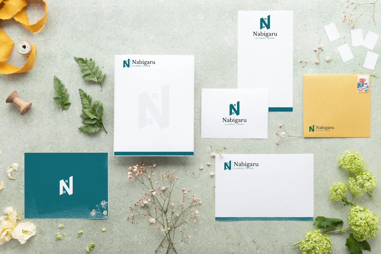
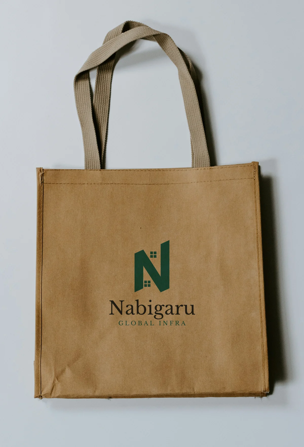
The identity on a T-shirt, a coffee mug, business cards, a stationery set and a kraft tote. These are mockups — the logo placed onto photographs of blank products — not photographs of finished production runs.
FAQ
Makos Digital designed it in January 2022, as part of the same engagement as the Jehovah Rophe Infra logo.
The N is drawn as two towers joined by a diagonal brace, with small windows in the gaps between them, so it reads as buildings as well as the company's initial.
Yes. The same mark and wordmark serve both Nabigaru and Nabigaru Global Infra — only the descriptor line beneath the name changes.
Yes. Makos Digital built both Nabigaru websites, which launched on 1 January 2022 alongside Jehovah Rophe Infra's.
Yes. Logo and brand identity design is part of our Branding & Creative Design service — contact us with a short description of your business and we'll tell you how a logo project would run.
Need a logo or brand identity?
Tell us about your business and we'll show you how a logo project would run — real concepts, not templates.